Content
Unlocking Revenue Insights Part 2: Using Cohort Retention Analysis to Understand and Improve App Revenue Growth

Greetings Glassfyers!
We are excited to continue the analytics improvement release series with our latest enhancement: Cohort Retention Analysis. This critical addition to our analytics toolkit empowers apps to gain deeper insights with pinpoint accuracy into user behaviour, maximise engagement, and achieve sustainable growth. In this blog post, we will explore what cohort retention analysis is, why it is so impactful, and how it can transform the way you understand and optimise your business strategies.
Understanding Cohort Retention Analysis
Cohort retention analysis is a powerful analytical tool that allows app owners to track the behaviour and retention of user cohorts over time. Rather than looking at overall user retention rates, cohort analysis groups users based on common characteristics or behaviours that you choose and measures their retention and engagement within specific time frames.
For example, a cohort could consist of users who signed up in a particular month, and cohort retention analysis would track their ongoing engagement and retention rates over subsequent months or periods. By comparing cohorts, apps can identify trends, patterns, and drop-off points, providing invaluable insights for optimising user experiences, marketing campaigns, and product offerings.
Why Cohort Retention Analysis is Impactful
- Granular Insights: Cohort retention analysis breaks down user retention and engagement metrics into distinct segments, enabling businesses to pinpoint specific areas of strength and weakness. By understanding how different cohorts behave, businesses can identify factors that contribute to higher retention rates and replicate successful strategies across the user base.
- Identifying Improvement Opportunities: Cohort retention analysis reveals critical drop-off points in the user journey. Whether it’s a specific onboarding step, feature adoption, or subscription renewal, businesses can identify pain points and take targeted actions to improve user experiences and increase retention rates.
- Optimising Marketing Efforts: Cohort analysis provides a deeper understanding of the effectiveness of marketing campaigns and user acquisition channels. By tracking the retention rates of cohorts from different acquisition sources, businesses can allocate resources more efficiently and focus on channels that attract users with higher long-term value. Keep in mind, today this needs to be done on your side - for now.
- Product Iteration and Personalisation: Cohort retention analysis helps businesses evaluate the impact of product updates or changes on user retention. By comparing cohorts before and after specific feature releases, businesses can assess the effectiveness of updates and iterate on product offerings to meet evolving user needs. Additionally, cohort analysis enables personalised user experiences by identifying cohorts with unique preferences and tailoring offerings to drive higher engagement and loyalty.
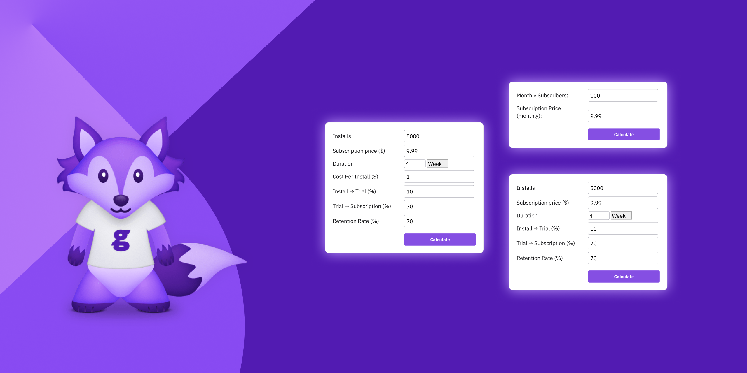
How Cohort Retention Analysis works inside Glassfy
Cohort Retention Count Analysis
Allows you to define cohorts based on a time granularity of your choice (day, week, or month), as well as any relevant filters such as country or store. You can also specify the subscription duration (weekly, monthly, quarterly, or yearly) and the analysis will be carried in that unit.
Each cohort is labeled with the first day of the related granularity, and the table displays the number of users in each cohort and the number of users retained at each subsequent subscription duration.
For example, if you choose weekly subscriptions, you will observe retention after every week. If you choose monthly subscription, you will observe retention after every month.
The table cells are color-coded with a heat map that ranges from purple (when the whole cohort is retained) to yellow (when none of it is retained).
Cohort Retention Percentage Analysis
This follows the same approach as the Count Analysis, with one key difference: all cohorts begin with 100% retention if they have at least one user, and decline to 0% over time. This normalisation enables easy comparison of retention rates across different cohorts, regardless of their size.
Read More